Redesigning the UI of a billing platform
The company
Ezypay has been operating since 1996, their main product is a payment billing platform specialised in recurring transactions. It integrates with the Client’s systems through API calls and allows them to bill their members for the specified amount at the preferred recurring cycle.
The problem
Legacy application. The cloud platform had been upgraded with additional features over time.
A local application was used to access the data (not running on the latest version of Microsoft Windows) and had not been updated since then.
The Support Operators had to create tickets for the software engineers to change even the smallest thing on their behalf.
While the business was growing, the number of tickets and the time required to solve them was growing too.
Part of my job was to create a framework that could support growth. I designed the application with scalability in mind, while at the same time creating as little disruption as possible to the daily operations.
Summary
I joined Ezypay as a UX/UI Design Lead in 2018 as a solo designer in a company of more than 70 employees distributed across 5 countries. I was responsible for leading the UX and UI across the whole client-application used to access the platform.
I grew tremendously in the years spent at Ezypay, some key achievements include:
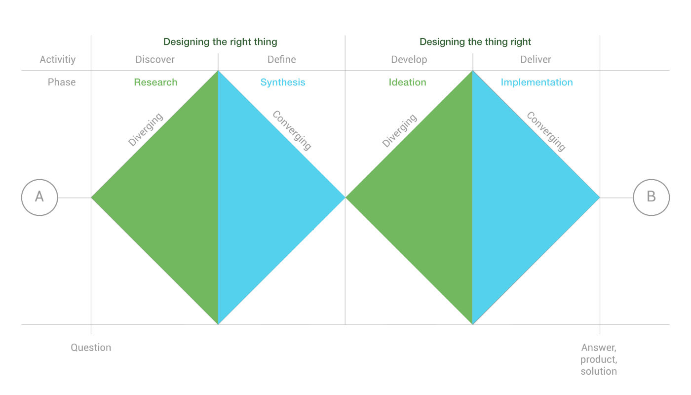
- Implemented a design process. I used the double diamond approach in problem-solving; allowing the team and the stakeholders to “explore” the current context and understand what problem we were trying to solve, and then to “converge” together toward the shared solution. This helped establishing more structure to how we conducted our work and allowed other teams to gain visibility across the subsequent sprints.
- Improved usability across the platform. As no usability tests had previously conducted, I made sure we collected data for future comparison and impact assessment of features built moving forward.
- Establishing a design system and a pattern library. This helped the Engineering and Product teams to understand how and why we chose to implement certain components over others. It also helped maintain consistency in the look and feel across different parts of the client-application.
Roles
I worked with a cross-functional team as a UX/UI designer, collaborating with the Engineering team. I conducted research and interviewed users to make sure we were tackling the right problems.
In the initial 3 months of the project I was the only person working on it.
The team grew to include:
- UX/UI designer (myself)
- Senior full-stack developer
- Junior front end developer
- BI data analyst
- Back end developers and DevOps were involved as needed
I designed the wireframes, and integrated changes gathered from prototype testing sessions feedback. I ran workshops with cross-department stakeholders for feature prioritisation and presented the milestone achievements to executives. Furthermore, I contributed to the supporting documentation.
Defining goals
Understanding the business case. The company needed three main things:
- a tool powerful enough for the Support Operators’ daily operations
- a tool that in the future could be open to external Clients allowing them to access the platform with a GUI rather than solely with API calls
- a tool with a modern look (remember: the legacy application was built as a desktop app for an old version of Microsoft Windows)
Understanding the Platform. I began with an in-depth interview with the Support Operators to learn more about the platform and the operations they were performing on the system.
The most common scenario entailed a customer on the phone with one of Ezypay’s representative, needing to access data from the platform.
The process
I followed the Double Diamond model combined with Agile methodology and Scrum. We adapted the process to be executed in the cycle of two week sprints, where the first week was spent investigating the problem and making sure we were designing the right thing, and the second week focused on the execution of designing the thing right.
User needs
Before Ezypay even hired someone to design the new client-application, a legacy application was already in place. It was made with low consideration of usability and learnability; it was most likely developed solely from an engineering perspective.
I conducted user interviews with the primary users (Support Operators) and discovered major pain points affecting their productivity.
The goal of my research phase was to:
- Understand the user goals and needs
- Discover pain points across the current user journey
- Define the success of the main tasks
Features list
After conducting the user interviews I grouped the pain points into affinity maps. This informed our Feature Themes and Epics.
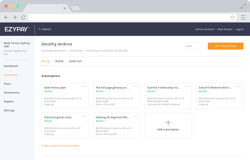
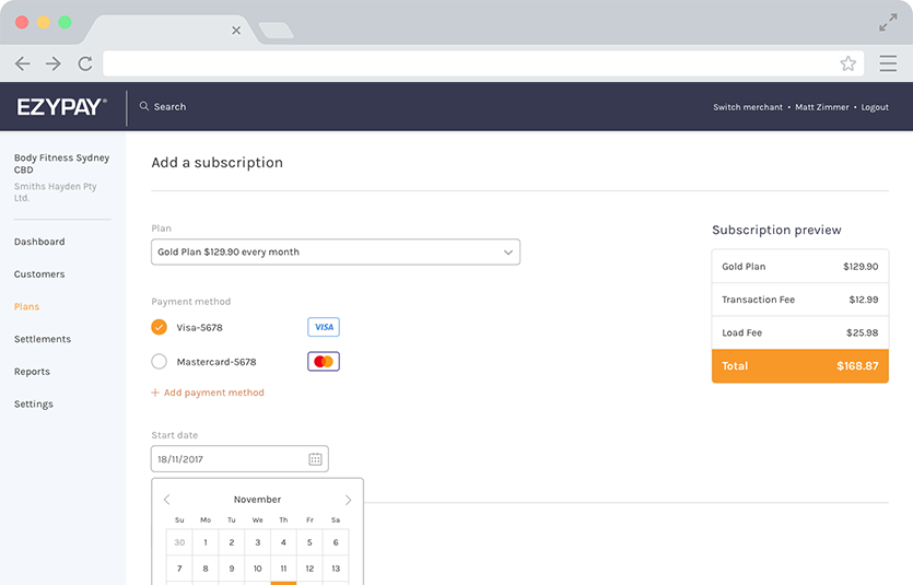
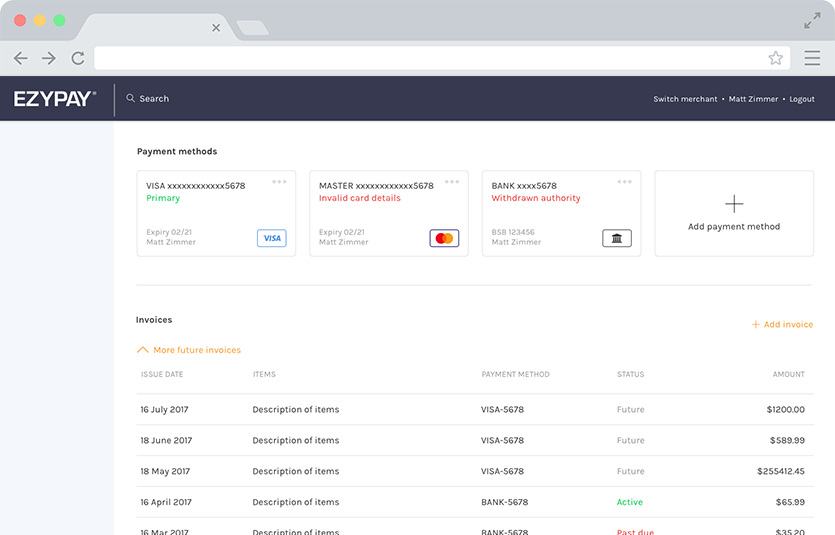
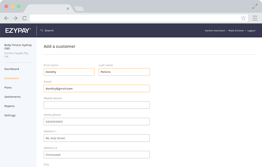
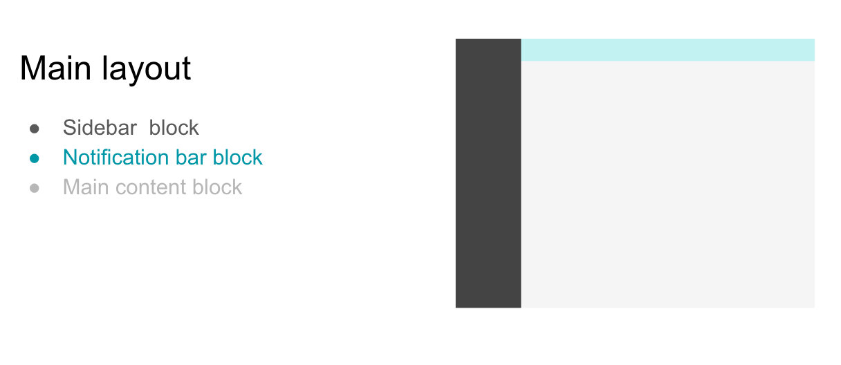
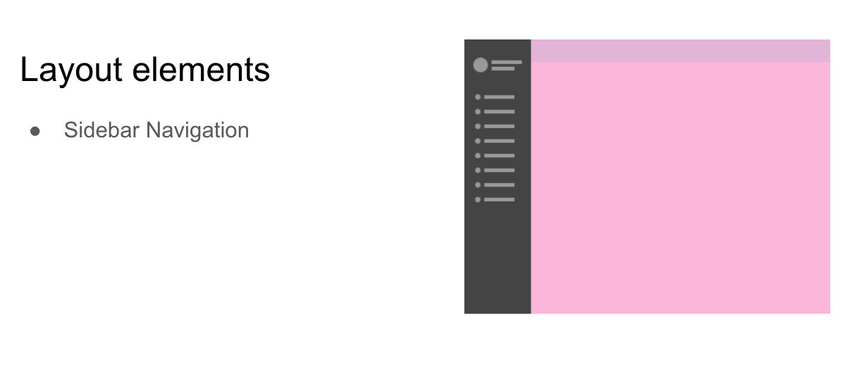
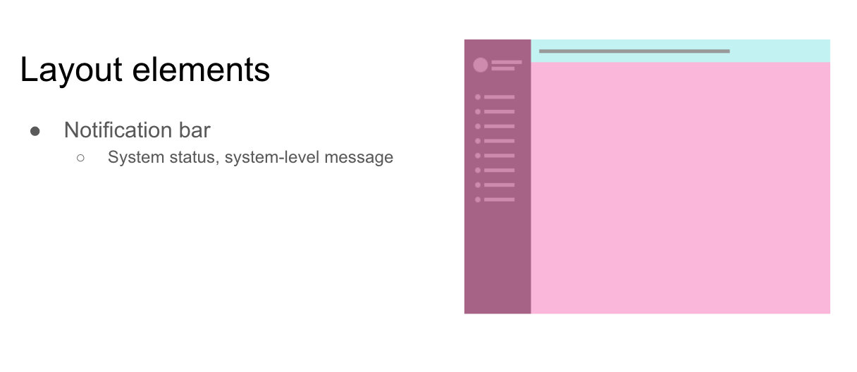
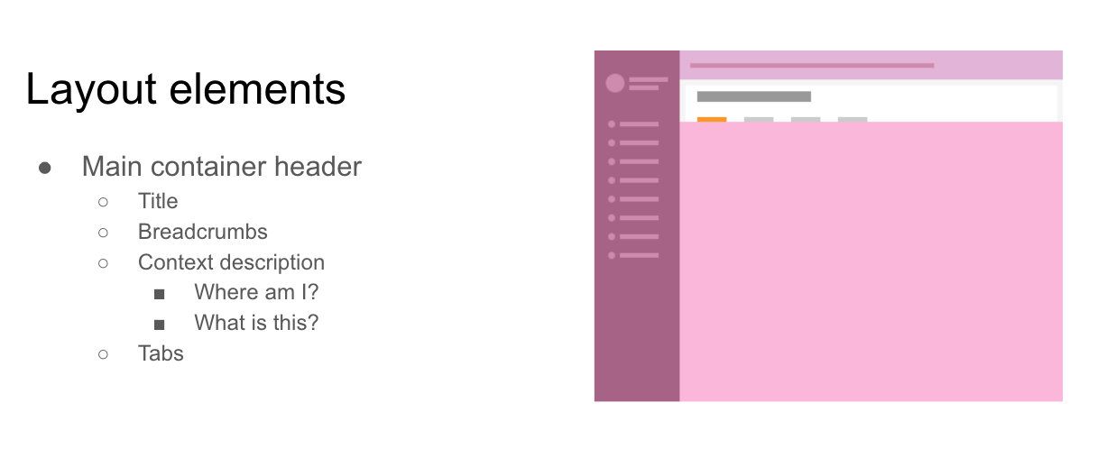
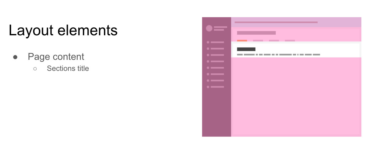
IA structure
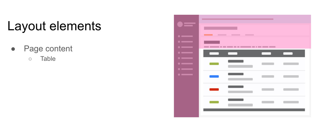
Having a clear IA (Information Architecture) for this application was crucial, the following images show the main layout and how the information is displayed across the pages.
Tools stack
It is essential to use the right tool for each job. Here is a list of those I used during this project:
- Sketch
- Miro
- Zeplin
- Balsamiq
- WebStorm
- VSCode
- GitHub
- Source Tree
- Jira
- Trello
- Browserstack
- Vue.js Devtool
Technology stack
The Single Page App is built on node.js; I wrote the templates with Vue and used Bootstrap4 as a starting framework. The client-application uses GraphQL to fetch the required data, stores it in Vuex before passing it to each component.
- Node
- Vue
- Vuex
- Bootstrap
- Bootstrap-vue
- Sass
- GraphQL
- Hasura
- Webpack
- Cypress
Deliverables
With the design and development of the client-application, Ezypay’s Support Operators acquired a window on the cloud platform that allows them to manipulate the data without needing the Engineers to intervene.
From the very first iteration of the MVP, the company has had a reliable tool used for daily operations by the Support Operators and later on has been adopted by Sales and Marketing to overview the onboarding process of newly acquired Clients.
Additional features have been implemented over time by running user interviews and workshops with internal stakeholders.
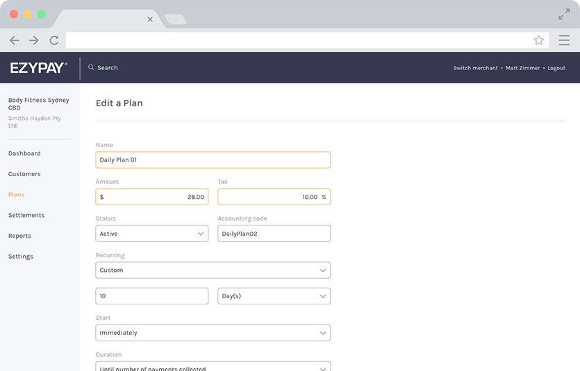
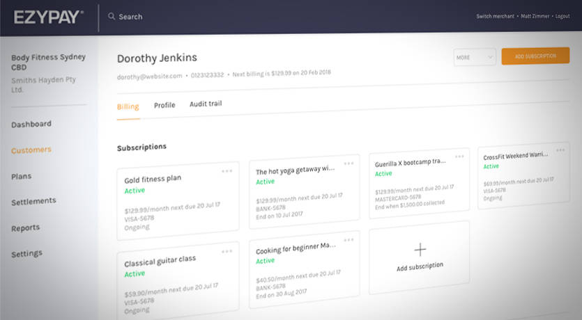
Gallery
Click the pictures to enlarge.
Results and takeaways
Since the implementation of the new client-application, the business saw a significant decrease in the number of tickets lodged, as well as a significant decrease in response time.
Additionally, I have received positive feedback from users about the usability of the new application, as it improved the onboarding of new employees.
Some key takeaways from this project include:
- Create a strategic plan. This helps deal with out-of-scope requests that could potentially derail the project and helps deliver a quality product in time.
- User testing doesn't end after development. Design is an iterative process of improving the experience for the end-user. Finding ways to collect and listen to your user's feedback should be an ongoing task.
- Involve software engineers upfront. Especially when the context of a SaaS, it will allow early discovery of implementation issues. This will also improve cross-department collaboration by letting the engineers constructively participate in the decision-making process.